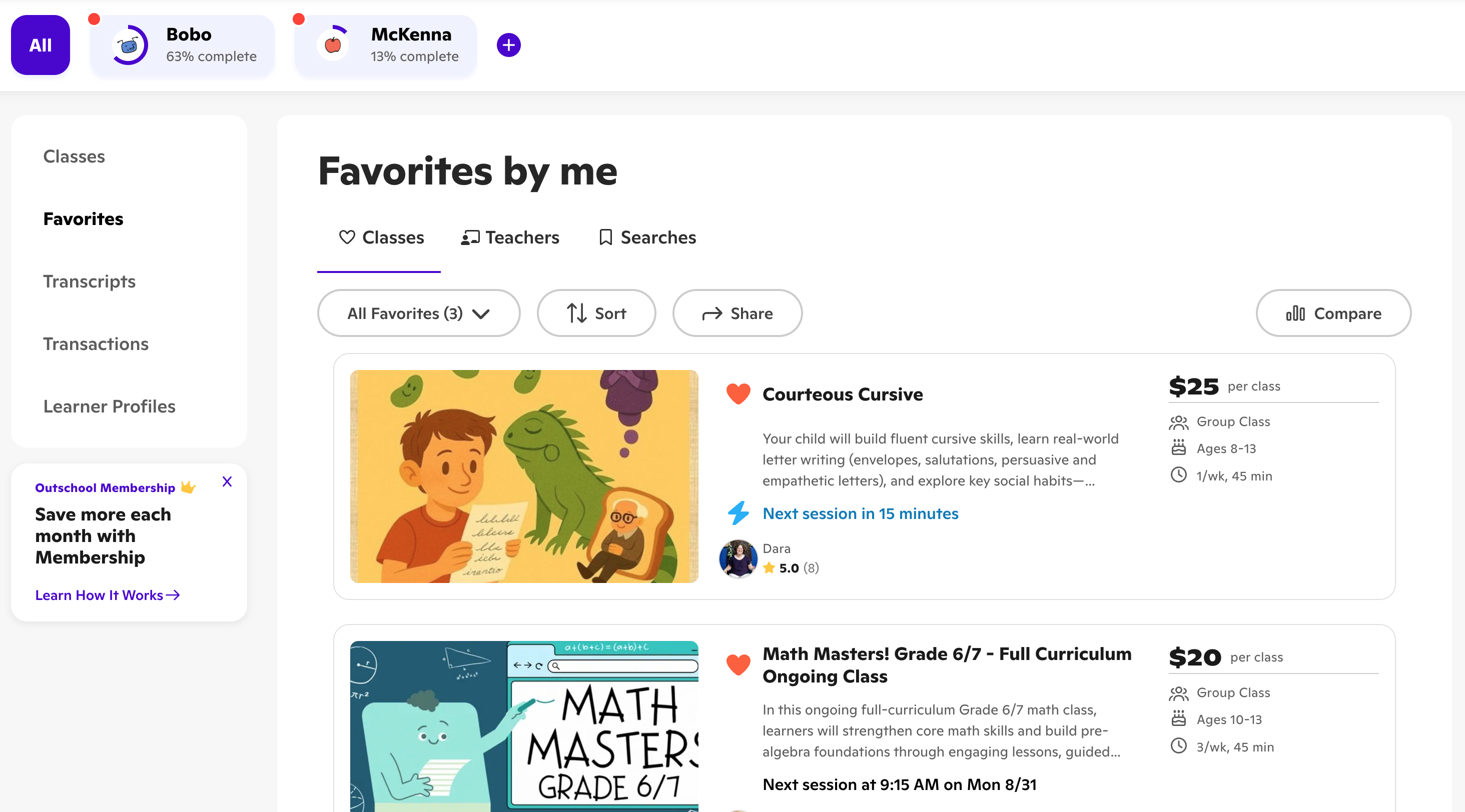
I rebuilt the dashboard
2 clicks · to any core job
The dashboard was an afterthought, and users treated it like one. They considered it an afterthought and left it to get anything done. I rebuilt it so the core jobs live in one place, two clicks away.
The problem
Outschool's dashboard was effectively useless. You could not change payment, enroll in a class, adjust an enrollment, or message a teacher from one page. Even joining a class was confusing.
We interviewed dozens of users and they confirmed our hypothesis.
What I did
Redesigned the dashboard and the settings pages behind it, in addition to fixing a bunch of design and tech debt. The goal was to collect scattered actions into one place and make every core job reachable in a couple clicks.
What moved
The dashboard became useful again, users wrote into CX less, and subjectively found the design to be better.